Wednesday 31 March 2010

Evaluation Question 4

How did you use media technologies in the construction and research, planning and evaluation stages?

Research & Planning:


In the research and planning software, not many media technologies were used compared to the other sections in the project. When drawing out storyboards, we scanned in the images onto the computer. This allowed us to create animatics, putting the images to the music. Even though the drawing were only rough and the timing was not exact, it helped us develop a clear idea of what we wanted to create. To research similar products, the internet was used alot. Websites like YouTube and Google were great helps when it came to researching similar products that already exist in the media world.

Construction:

The first stage in the production process was to import the trac kthat we had finally chosen. To do this, we had to download the music and bring it to school using a memory stick. The version of the song we had had a long beep at the beginning. In Final Cut Express we simply trimmed the beginning of the song using the cut tool, then locked the bar so the music could not be moved or adjusted anymore.
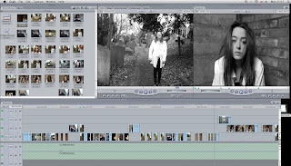
Above is a screen shot of Final Cut Express showing various rows of video used. This allowed us to layer the images and get the cuts more exact and to beat. The two screens allowed me to set in in and out points of each clip on the other timeline to ensure we had the specific footage we wanted before inserting it on to the music video timeline located at the bottom of the screen.

To go with the fuzzy noise that occupies the beginning of the song, we found a effect that fits the sound perfectly. The effect named 'Bad TV' made the image split in two and shake, reflecfting the noise perfectly. This is another way that the music drives the editing in our video. An example of the Bad TV effect is shown below from later on in the video.


Also using Final Cut Express, we were able to increase or decrease the speed of various clips. This allowed us to make each individual clip fit perfectly with the clip.

Through out the construction of the music video, we used two filter on Final Cut Express. the first was colour corrector, the very helpful tool that enabled us to change every clip to black and white. Without this tool, the quality of our would of suffered. We also used the Chroma Key, which allowed us to isolate one colour and leave the rest of the shot in black and white. We used this tool every time the blood appeared in the music video. Without this, the narrative being expressed in the video would suffer.

Example of colour corrector:

Example of Chroma Key:

Anciliary tasks:

To create the digipak, I used Adobe Photoshop to edit the images and layer on the text. I then saved each panel as individual JPEG's. This allowed me to insert each image in to Microsoft Word to put all of the images together in the same style they would be in the digipak. I then used the 'Grab' tool on the Mac to take a screen shot of the overall picture. I also took each individual image and put it in to Photoshop and used the 'Free transform' tool to manipulate the images to make them fit on to a 3D CD case. The website was created using Adobe Dreamweaver which allowed Lucy to insert images and create a clear and understandable layout for the website. The buttons and the title were all created in Photoshop and imported in to Dreamweaver as images. Without this software technology, our products would not contain any quality and it would have been very hard for us to create a coherant house style.

Evaluation:

In the evaluation process of this project, I created slide shows to bring excellent use of ICT in to the evaluating. This allowed me to improve the overall quality of my evaluation. I hosted the slide show on http://www.slideshare.net/ then got the code to embed the presentation. I also used scroll boxes in the evaluation of my clips. This allowed me to keep all necessary information together, improving the presentation of my work. Without this technology, it would be 100% text which is dull.

Evaluation Question 3

What have you learned from your audience feedback?
Music video:
To start with, we asked classmates and our teacher to view our rough cut. From the initial feedback we got regarding our rough cut, the general thought was that the video itself was too repetitive. Another criticism of the rough cut was the changes in colour. Some of the scene were not changed into black and white whereas some that were in black and white, the blacks seem to harsh and did not match the rest of the video. An example of this would be the shot of the sky as it almost appeared grey and white instead of black and white.

After using the colour corrector tool in Final Cut Express to desaturate all of the images and alter the tones of darkness, we came to an agreement as a group that the whole video looked better in black and white. Runi altered the clips, ensuring that the black and white tones were the same throughout.

Another wish of our teacher was to ensure that all of the scenes that included 'blood' were black and white but with the red of the blood showing. With the blood in the red, it decreases the quality of the narrative and does not make any sense to the audience. To change this we used the chroma key tool to put a 'Sin City' effect on the footage. This small change improved the quality of the video enormously.


The main feeling we got from the audience feedback in this section was that the video was too repetitive. The only way we could solve this problem is to go out and film more interesting and intriguing footage to help us develop the narrative. This is exactly what we did, but this time concentrating more on the framing on the shots as well as capturing more close ups. A wider range of close ups will grab the audiences attention and keep them interested during the whole video.

Music Video- Second Stage:
After completing the list of changes to be made to the rough cut, we posted what, at the time was, the rough cut. We used the social networking site of facebook as this was the easiest way reach our target audience. Soon after posting the video, we soon realised from the comments, that is was not in fact our final cut. Taking on board the comments we received, we went back to Final Cut Express and changed what we could in the short time left.

Below are the criticisms we received.


After completing the necessary changes, we finally produced our final cut. The difference between the rough cut and final cut are amazing. When showing the final cut of the video, 100% of our audience liked the product and thought our product was a credible media text of its genre.

Digipak:

Above is what the digipak initially looked like after the first attempts of making it. However, after receiving feedback we soon realised that changes had to be made. Firstly, fellow classmates said that the front cover looked like a shot from a spoof 70's horror film with the colours and fonts that we had chosen. This comment quickly meant that the atmosphere that we were trying to create was lost. Another comment that was made that the track listings on the back were too small, making them hard to read. This could maybe lose the band customers as they may be put off by this. As well as this there was no link between the pictures and the video as the video is in the black and white and this product is dominated by colour. It was also recommended that for the disk image, we remove the background from the image and just have me with the champagne glass. This will prevent the audience losing interest, with their attention going straight to the figure on the disc.

As a group, we went back to the drawing board and thought how we could link in the video to this product and make it overall more professional. We then produced this final product (shown below) which many people preferred.

Website:

Out of both of the ancillary tasks, the website presented us with the least criticisms as many people liked the first draft. The only comment that was made was the website would be 'more pleasing to the eye' if the five images were separated slightly, making each image clear and visible.


We got positive feedback from a member of our target audience, a member of our class 'Kelsey James'. She really liked the fact that when the images and buttons were touched with the mouse, they changed colour. The website was an achievement for us. All members of the class thought it could be used as a real media product.

Evaluation Question 2

How effective is the combination of your main product and ancillary texts?

The main task for this coursework project was a music video, accompanied by two ancillary tasks, produced at an equally high level as the video. The two ancillary tasks that we chose to do as a group were the Digipak and the home page for the band website. These three tasks had to create a brand to promote the band. The most effective way of doing this was by creating a coherent house style that is recognisable over the three products. This is because it is these products that will capture the target audience and bring great success to the band.


Thorough out the research stage, we knew that our song belonged in the Indie-Pop genre, allowing us to immediately identify the target audience was 17-25 year olds. We wanted to make the product as appealing as possible to both males and females. This proved to be harder than it sounds, as the final product is quite dark and 'evil', so the only females that would be interested in the product would be the 'Indie/emo' type or girls that find the male band members attractive! We decided to target the people that we knew would like the product instead of attempting to please everyone. When listening over and over to the song, listening closely to the lyrics, ideas sparked and ignited, allowing us to feed off one another to make the video and all final products as creative and fitting as possible.


The brand created over these three products is effective as there is a professional and stylish unique house style through out. The same colours are used over the products with every product bringing in the vibrant red colour from the 'blood'. The music video is black and white through out, with only the blood, candles and light bulbs bringing in fragments of colour into the music video. The drop shadow on the digipak incorporates a colour into the otherwise dark album case. The website is the true home of the brand image, with the band name written in a different font, acting as a logo for the band. The same colour theme is also used on the website, with the images changing from colour to black and white when a user interacts with them. During the research process, it was clear to us that we had to create a product like this. All of the bands websites reflected there latest album cover, linking the products together. We had to consider this when gaining the images that we were to use for both the website and the digipak.

We found the process of deciding on and finding an appropriate font for the digipak and website. On the first attempt at the digipak, we used a horror film inspired font, with blood dripping and bats living on the M's. We then went on to use the same font on the website to attempt to make a coherent house style. Once the font was applied to the website, with parts cut out using Adobe Photoshop, we found that it did not only act as a header for the website, but also a band logo. We then went on to change the font used on the digipak to a clear serif font, making the band name stand out on the cover. We did not, however, change the font on the website. Even though the website and digipak employ different fonts, a coherent house style is still clear over the products, the choice of colours helping to create this. The combination of font and colour on the digipak helps to create the creepy and eerie that fits in well with both the website and the band image.


The images used on the digipak and website are all snapshots from the music video itself, helping to create a strong link across the brand. Some of the images were taken on the day of filming to decide upon shots and angles and these turned out better than we expected, earning a part on the montage of image on the inside page of the digipak. With the images on the digipak and website, we wanted to create a image that would reflect the characters feeling to help to encourage audience involvement. I think that the images used enabled us to successfully create a brand image, including all three products. During our video, there are a few short clips of the woman in the white shirt slitting her wrists. As our target audience is the young indie scene, they could maybe relate to this. However, the video does not promote this unnecessary action, she is shown to be possessed and forced into doing this. We made the storyline like this so if the product was real, there would be no controversy surrounding the product. We also, however, used a few of these images in the montage on the inside cover of the digipak. As it is only a small image and clearly has a strong link to the music video, this should not be a problem.


The only sound used in this product was the music by The Ghost Frequency. This sound is also heard on the website as the video is placed on the website to help to promote band and single. The images and narrative all fit in with the music chosen. We found it quite difficult at first to expand on the music and to make unexpected products. We soon came together to create a creative, stylish and intriguing product and brand.

Looking over the products, I am really proud of the girls and what we have achieved with our creations. I think the images work well on the digipak and website, the narrative is excellently suggestive in the video. The only thing I may change over the three products if the font used for the band name on the front cover of the digipak. This is because it does not match the font used for this on the CD. Changing this small feature would largely increase the professionalism of the overall product and brand.

Evaluation Question 1

In what ways does your media product use, develop or challenge forms and conventions of real media products?

Andrew Goodwin’s Theory reads that:-
  • Visuals either illustrate, amplify or contradict the lyrics and music. We have followed this convention as the visuals in the video match the lyrics of the song.
  • The different music genres often have their own music style/iconography. Our song represents the Indie genre and I believe that our music video would fit in comfortably with this genre.
  • Close ups should always be included. We have used a number of close ups to identify and introduce the characters to the audience. Also, the close ups capture the characters feelings and reactions.
  • 'Amplification – occurs when videos introduce new meanings that do not contradict with the lyrics but add layers of meaning'. This is clear in our video as we have taken the lyrics and creatively experimented with them, creating our own storyline and meaning to the song.
The general theory behind music video identifies that the lyrics of the song often establish a general feeling/mood/ sense of subject rather than a meaning. The tempo of the music drives the editing, changing the pace and the method used for the cuts. The genre might be reflected in types of mise-en-scene, themes, performance, camera and editing styles. The camera work has an impact on meaning. Movement, angle and shot distance all play a part in the representation of the artist/band (close-ups dominate). With editing, the most common form is fast cut montage, rendering many of the images impossible to grasp on the first viewing, so ensuring multiple viewing. I feel that our music video meets and includes all of these conventions, resulting in a realistic and professional looking music video.


Our opening shots ,shown above, straight away convey how the character feels lonely. The bad TV effect used on the opening shot (shown to the left above) disorientates the user, straight away grabbing their attention and leaving them intrigued by the video. The mise-en-scene and setting of these scenes creates a eerie and uncomfortable feeling, acting as a great introduction to the haunting storyline. The character then goes on to appear on different parts of the path, following the beat of the music. This is clear evidence that the tempo and the beat of the music drives our editing in this music video. As she moves down the path, we used normal cuts to create a seamless but harsh movement to go with the beat in this section of the music. The main characters outfit is shown straight away to the audience, adding to the strange aroma that occupies the music video.

Here is a montage of some of the close ups used in the music video. Using close ups encourages audience involvement, initiating a relationship between the audience and the character/band. The first close up shown above is of the main character which first appears 52 seconds into the video. The expression on the characters face clearly shows her desperation and suffering. I think this shot effectively creates a level of sympathy from the audience for this character. It efficiently adds to the narrative of the music video, clearly expressing this characters reactions of the 'haunting'. We used the artificial lighting created from the light bulbs in the garage for this shot. This created a natural look to the shot, allowing us to change it to black and white and still clearly see the image. We held the camera in our hands to make the shot more realistic and also to encourage audience involvement as the slight movement creates the feeling that the audience is involved in the quite personal shot. The second shot shown is a medium close up of the 'vampire' character in the music video. We filmed this in my garage as we felt that the brick background produced a cold and eerie feel to the video. She is holding one of the props used in the music video, the bread-knife. Holding this along with the serious and unhappy look on her face add to the atmosphere of the shot and adds to the narrative in the music video. We once again used the artificial lighting from the garage light bulbs to light this shot as it allowed us to create shadows whilst still clearly lighting her face. This shot conveys her attitude and purpose in the music video. The Third close up shows the 'blood tears' from the girls face which develop as the vampires infatuation with her increases. We used red food colouring to create this effect, continuously dropping more on my face and editing around the re-application process. This shot is very unusual and makes the audience intrigued with the reasons behind this behaviour. The editing process on these sequence of shots was quite difficult to get used to, but after researching for tutorials we managed to change the blood to red. This helped us achieve the impact that we was after when we developed the idea. We once again used a handheld camera to shoot these shots in my garage. This created a slight movement, which in the editing process we could emphasis more, creating a more eerie and disorientating feel. The last close up shown above is the shot where the audience establishes the clear identity of the vampire. Before this, she is shown with the Bad TV effect shown on her clips which leads the audience to be intrigued about who she is and her identity. This shot was filmed in the graveyard at St.Michael's Church in Wilmington, Kent. Even though the background is quite busy with the gravestones and trees, the audiences full attention is on the vampire as her face dominates the shot. At this point in the music video, the music jumps and this shot quickly appears on the screen, with the change in tempo of the music changing the pace of the editing.


Visuals either illustrate, amplify or contradict the lyrics and music.
Above are two images from the music video showing the main characters suffering in her bed when she is having a nightmare. The gestures convey her suffering, the hands on head and the shaking of her head are common reactions to pain and suffering, shown in many horror films. For this scene, we filmed in my bedroom using natural light from the window. We wanted the character to appear normal, not haunted, in these scenes as it increases the abnormality of the haunting scenes. The fact that she is wearing the same outfit through out the video makes it clear to the audience that it is the same person being affected in many ways. It also creates a sense of continuity through out the video. We filmed this from many different angles to increase the audience involvement in the scene as they feel involved with the scene. For both of the shots shown above, Fahmina Ali held the camera and stood over me. This close up showed the audience the characters suffering and feelings. this visuals follow the convention stated above as when the song lyrics mention a nightmare or suffering, these clips are shown. I think, as a group, we have successfully met these various conventions.


Above are four images conveying how we explored the meanings of the lyrics, creating a different and unique way to represent the lyrics and explain the narrative to the audience. The first image is of the main character running away from her troubles, but later on in this shot, the vampire appears once again. This conveys the on going suffering and suggesting there is no escape for the young lady. The next two shots show how as a group we experimented with the imaging to go with the lyrics "we saw the lights turn on". We started with the candles as it links in with the shots where the woman is sitting on the floor surrounded by candles. However, due to the amount of times these lyrics appear in the song, we soon found that we repeated the same sequence too many times. We then went on again to film a bare light bulb, editing it in post production to create the look that we have achieved which is seen above.


The cover for our digipak was created using Photoshop. The image for the front cover is a clip from the beginning of the music video, helping the create a strong link between the three products and emphasising the 'brand'. The shot is naturally lit, as it was filmed during the day. The effect were placed on the clip during editing using Final Cut Express. In Photoshop, the image of Lucy the 'Vampire' was carefully place behind the image of me, continuously suggesting the haunting. The mise-en-scene is also effective as it creates an eerie atmosphere for the front cover, similar to the other products in the 'brand'. When planning the digipak art work, I came across the image below and gave me a burst of inspiration.
The black and white effect on a shot of the landscape draws the viewers attention to the person, which is the affect that we wanted.


After looking at many band website, we soon realised that they have their own set of generic conventions. In the production process, we knew to make our website realistic, we had to follow and include these conventions (listed in the drop down menu above). I think the final product includes all of these features including the music video, images and links to many pages to better the experience for the user.

Tuesday 30 March 2010

Website Feedback

Here is some feedback we received from the homepage produced for the band website.
'I like how the buttons change colour when they are touched with the mouse. I also like how the photos do the same'


'I like the font used for the band name, its cool. I like the location of the video aswell, putting it in the middle will grab peoples attention'


'I like the colour scheme! I also like the pattern of colours going down the left hand side, its simple but is an interesting feature to the site'


Digipak Feedback

' I like how the image on the front cover is two images together, like Lucy is stalking Louise! I also like the red drop shadows on the text, putting it all the way through is good!'
'I like the collage of images used for the inside page. It links in well with the rest of the project!'
'I like the back cover, the cloud effect look really good! The bar code makes it look realistic, like it has just come off a shelf!'
'The image on the CD is powerful and stands out. The fonts on the front cover and on the CD are different but thats my only criticism'

Website


This is the home page for our band website to promote both the band and the music video. I am really pleased with how it turned out in the end, I think it really reflects the band and its attitude. Please find the link to our final product below:-


Final cut

After taking on board the constructive criticism from the second stage video, we have finally managed to produce our final cut!


FINAL CUT from Lucy Simonds on Vimeo.

Digipak changes

After a few changes to our first attempt of the Digipak, we are now happy with the final result (seen above).

Front cover:
To start with I changed the the image that appears on the front cover of the Digipak. I used a clip from the music video of me on the park in the graveyard. I then cut Lucy the 'vampire' out of another image that was similar. The clip I used was a snapshot from the music video when Lucy is moving down the path but when she appeared on the opposite side to me. I then inserted the small image of her on to the photoshop page and decreased the opacity to make her appear less dominantly on the image. I then added in the two titles, adding a red drop shadow to both to bring in a colour to the front cover.

Inside:
To create the inside page of the digipak, I started by creating a new file in Adobe Photoshop with a black background. Then, going through the final cut of the music video, I got about 30-40 images using grab on the Mac computers. Inserting all of these images ended up being more time consuming than I first predicted. However, I really like it think it is a great improvement to the digipak, making appear more professional.

CD:
Using the same image as the first attempt at creating the digipak, I cut out the image of me holding the champagne glass full of blood, I cut out the main image using the quick selection tool in Adobe Photoshop CS4. I then added three separate titles with each word in the band name being a separate title. I then added effects to these three titles. I added both stroke, adding a outline feature to the letters, and drop shadow which is effective when the words appear overlapped at the top of the CD. I then wrote the album name in the same font that appears on the front cover , creating a clear house style. To make the product appear more realistic, I added font saying "ALL RIGHTS RESERVED CITY ROCKERS LIMITED" which is the record label in charge of the band.

Back Cover:
To create this back cover, I opened a new file in photoshop that is the same size as the other squares with a black background. I then rendered the image using 'difference clouds' to create the foggy black and white image. I found that this image compliments the front cover as similar colours are used and also, it made me realise, that using a image like before made the back cover appear quite busy and over complicated. I then added the track listing using the same font as the front cover, helping to create a coherent house style over the product. To make the product appear more realistic, I added a barcode to the bottom right and a 'parental advisory-explicit lyrics' symbol to the bottom right. I also added a small piece of text similar to the CD reading 'ALL RIGHTS RESERVED BY CITY ROCKERS LIMITED'. These small features largely add to the realism of the product, ensuring that this product will fit in on any shelf in a music store.


Above is all of the images combined into one and adjusted so the images appear as they would on a digipak, done using Adobe Photoshop CS4 and the Free Transform tool. Overall, I like how the final Digipak has turned out and I am glad that I changed this product.

Saturday 20 March 2010

Second Stage

After showing our rough cut, we recieved a list of improvements which we then took on board and actioned. This resulted in our second stage video, which is called this as there is still some improvements that can be made.


Second Stage from fahminaali on Vimeo.

Tuesday 16 March 2010

Constructive Criticism...

After showing our rough cut, we received a lot of feedback on how we can improve our video. This included:-
  • Add more shots to develop the narrative- more spooky and intriging shots.
  • We need more shots of the vampire as she hardly appears in the footage
  • Swing shot- Try getting the two characters going oppoiste ways on the swings.
  • Create continuity with the blood shots in through out the video, making all of the shots black and white with the blood in red.
  • Make the sky shot darker.
  • Do a shot of walking from the possessed womans point of view.
  • Include more close ups to show the womans struggle.
  • Maybe film a clock to show how the nightmare is developing over time
  • Need more movement in the blood drinking shots.

We will now take this advice on board, refilm some shots and try hard to create a excellent end product.

Monday 15 March 2010

Rough cut

Below is our rough cut after our first attempt of editing the footage we had.


ROUGH CUT from Lucy Simonds on Vimeo<>

Friday 12 March 2010

Digipak First Try!

Above is our first attempt of creating the digipak. We used images from the music video to create a strong link between the two products. However, after viewing the product as a whole, we decided to change the digipak. The group and our teacher thought it lacked a clear coherent house style. Also, the choice of fonts on the front cover are more appropriate for a horror movie rather than a band. Involving coloured and black and white images meant we could separate each image and not be able to tell that they belong to the same digipak. Its back to the drawing board/photoshop!

Monday 1 March 2010

Making the website

Lucy Simonds was the creator of the website. I would of loved to be a part of it but the Digipak dominated my media lessons during this time.

To create the site, Lucy used Adobe Dreamweaver. Using a table, she carefully placed all of the images and buttons in a appropriate place. To make the images more interesting, they were made in to rollover images, changing from colour to black and white. This is a simple but interestng feature for the website.


Above are two screen shots from the website creation process. The top one is the process Lucy went through to create the rollover images in Dreamweaver. The bottom screenshot is the editing process, currently in this image changing the exposure levels.